
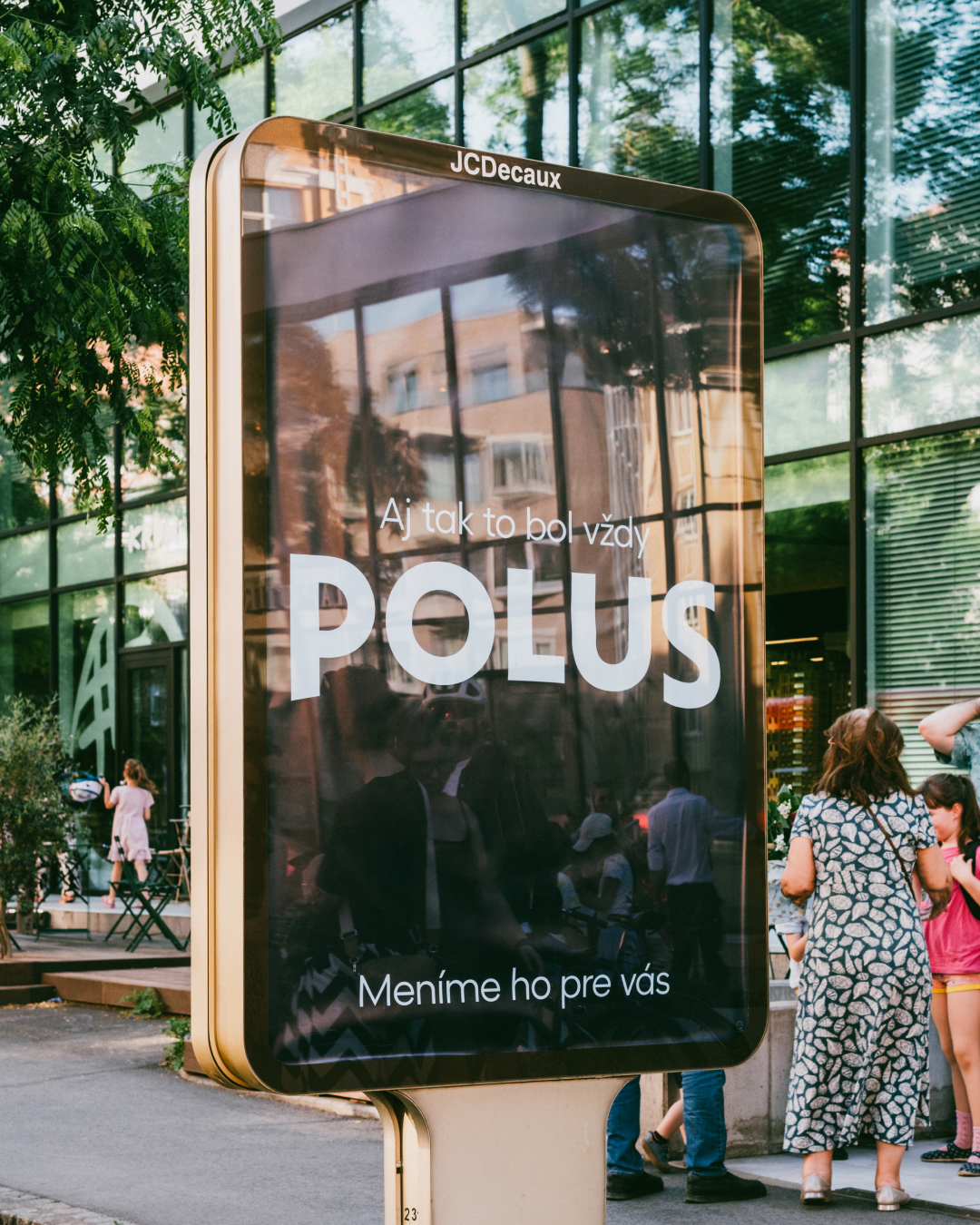
It has always been POLUS
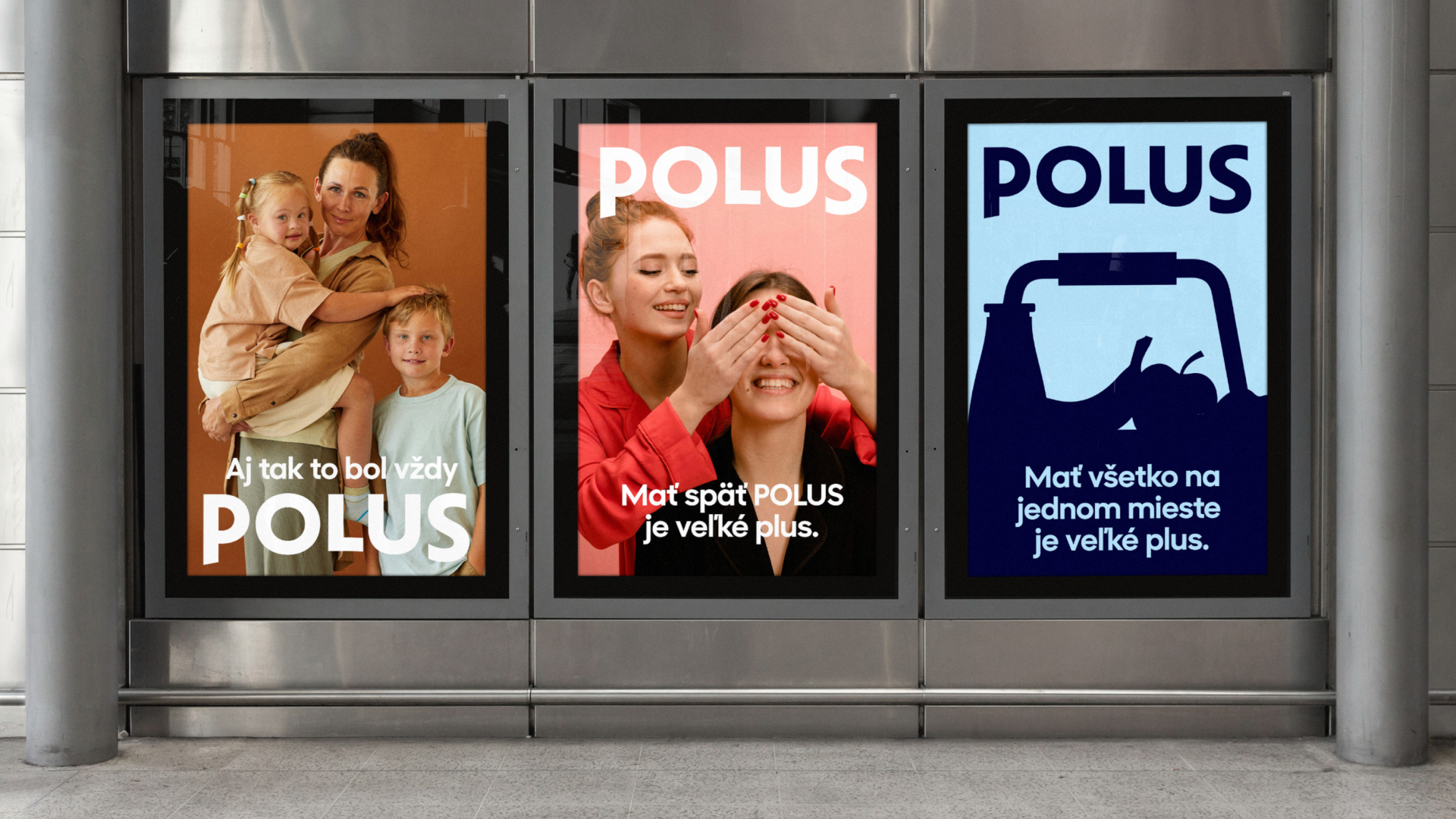
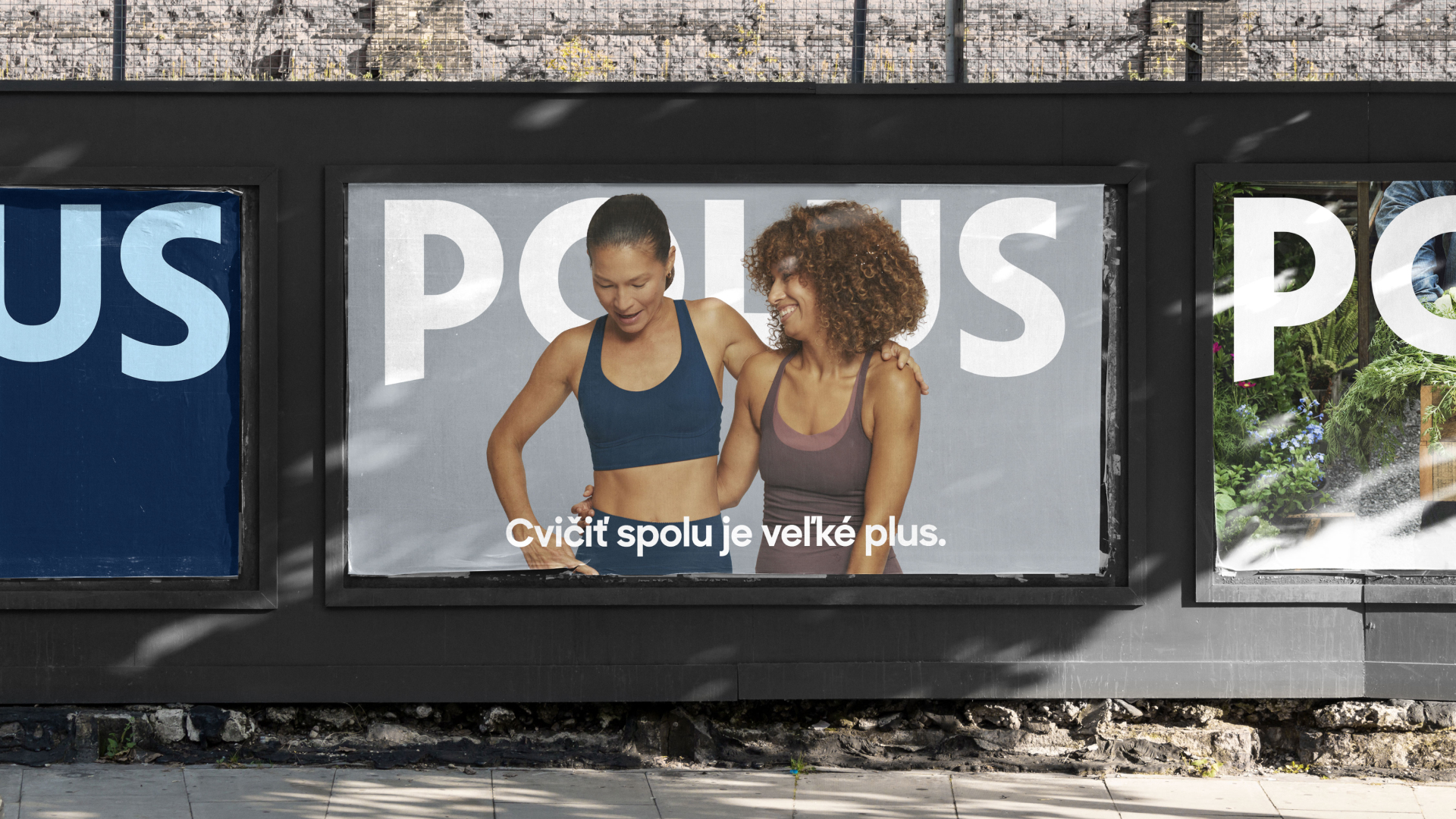
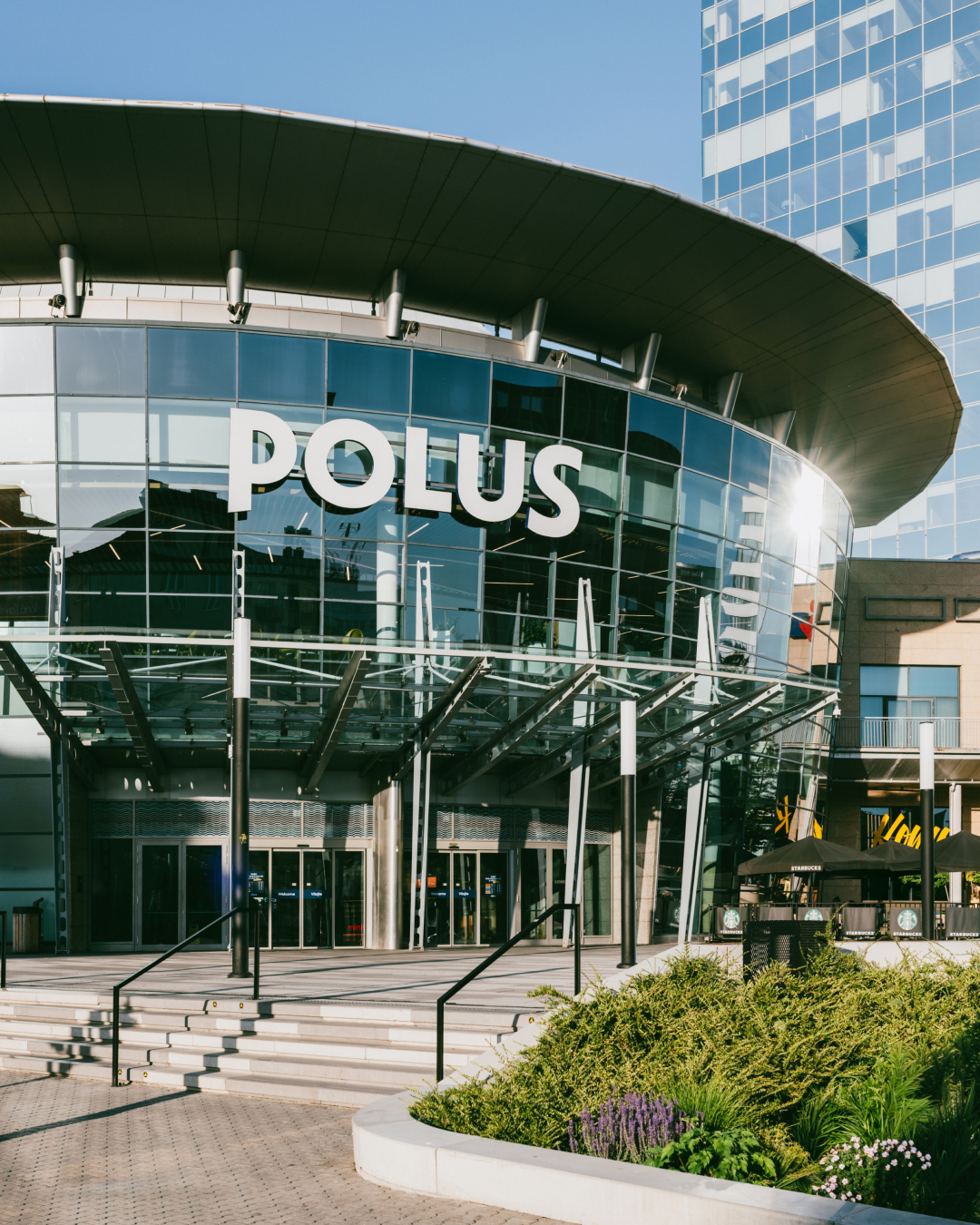
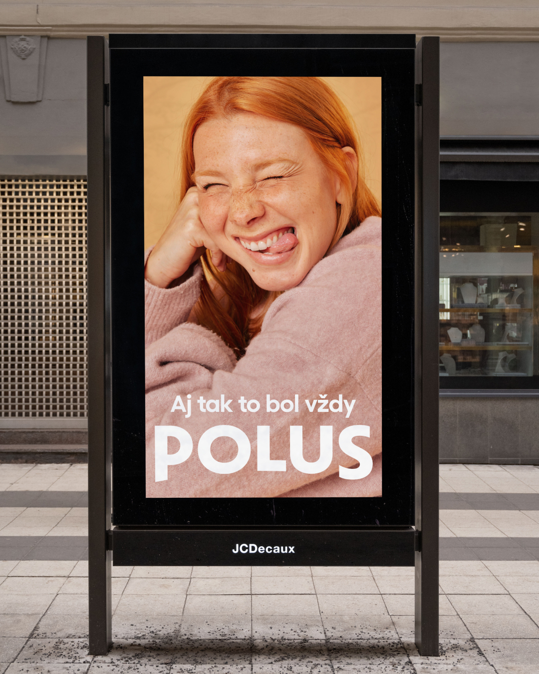
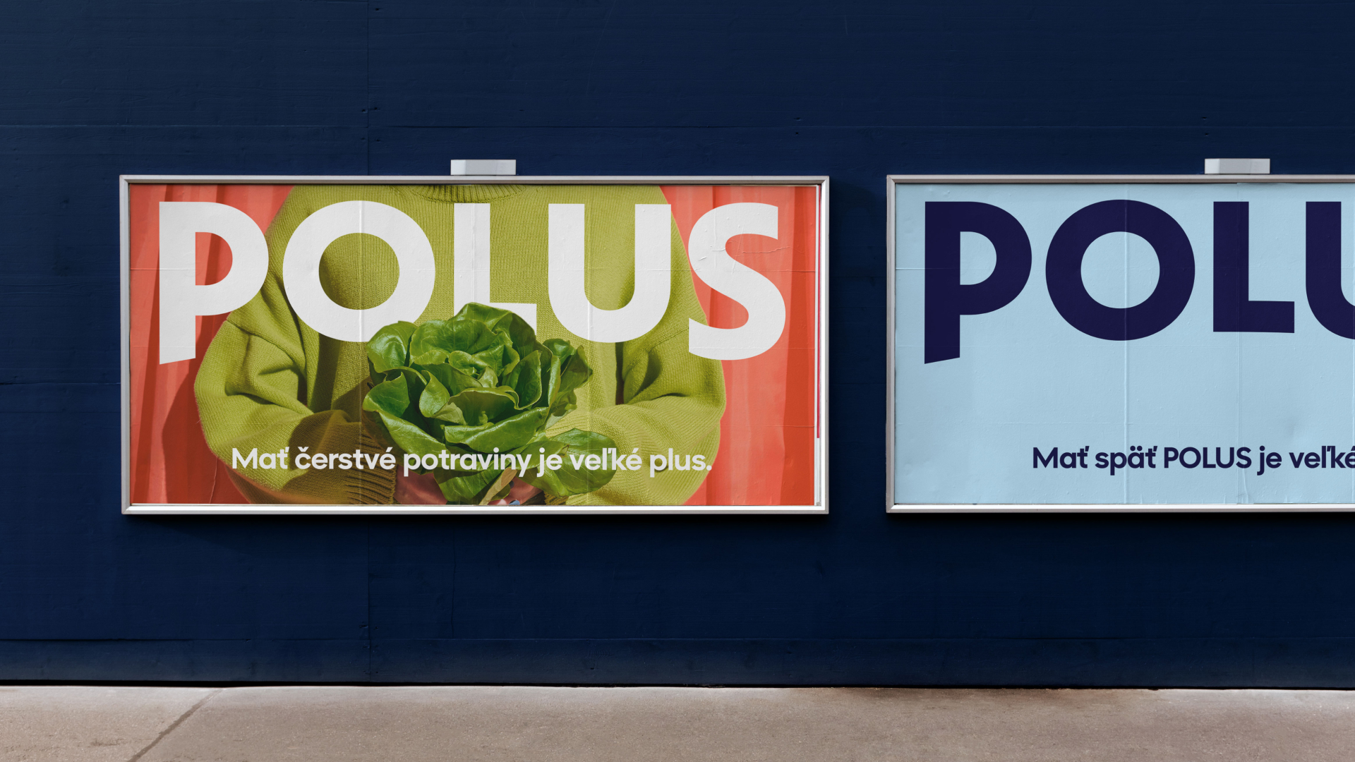
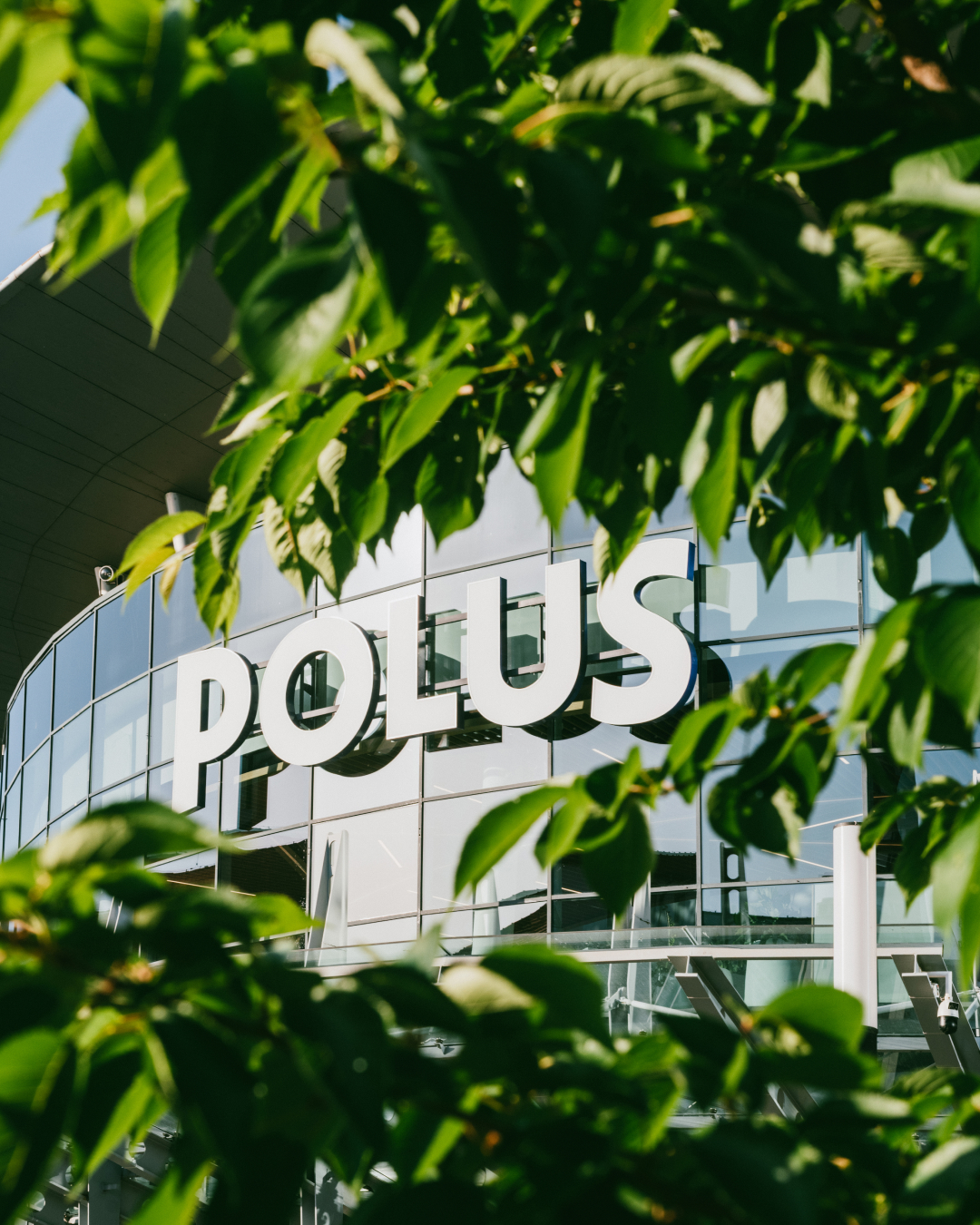
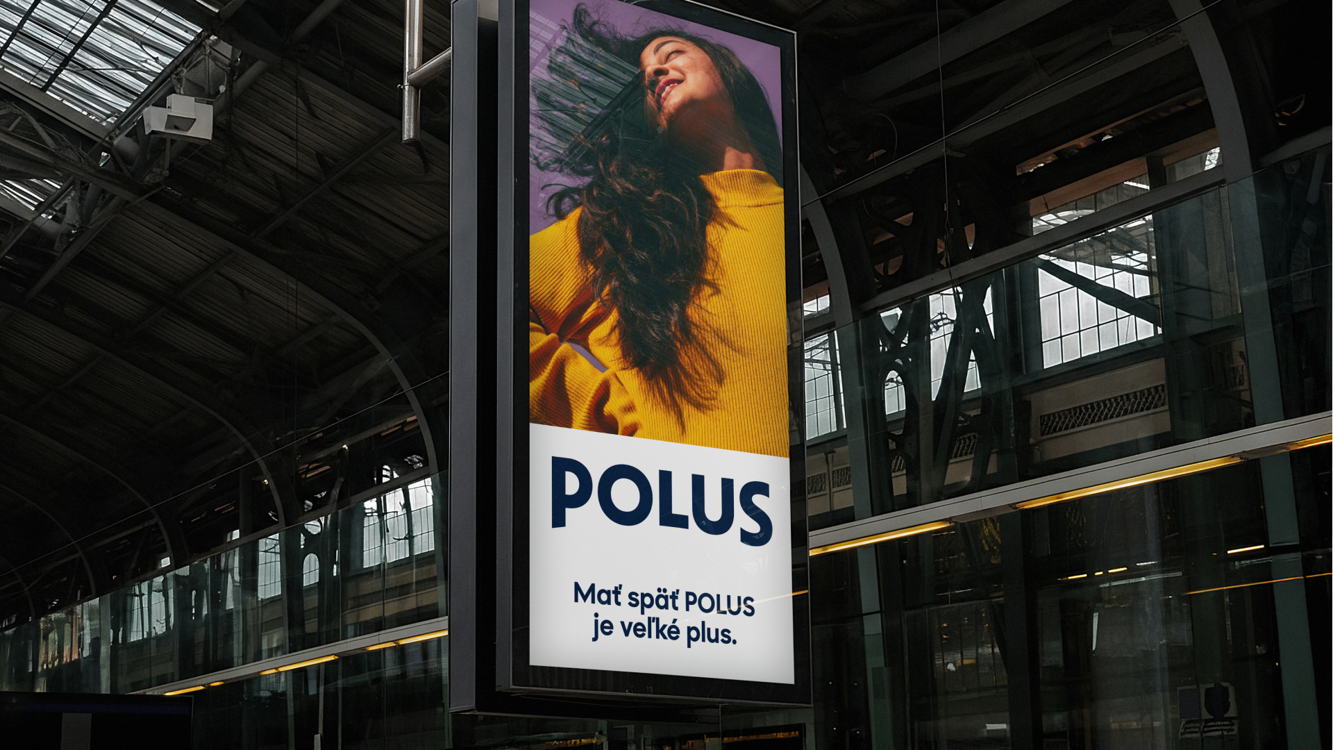
After seven years, Bratislava’s first modern shopping mall returned to its original name, and we were there to refresh its visual identity. The goal of the rebrand was to show that Polus is for everyone: from teenagers, through construction and office workers, to retirees. The art direction of photography reflects this too: it shows people in natural everyday moments that customers can relate to. The new logo is an evolution from the 2000-2019 identity, as if the 7 years under a different name, which hasn’t really caught on, never even happened. The slight arch in the logo comes from the building’s architectural elements and the horizon visuals of the old Polus City Centre identity. Our rebrand back to Polus was met with a strong positive response from the public, who never called it anything else.

client: wood & company
Strategy & verbal identity: Katka králiková
photo direction: bára Tabačková
campaign communication: slimák&slimák
Logotype: setup type
Photography: unsplash
© 2025