Langos bar
Traditional snack reimagined
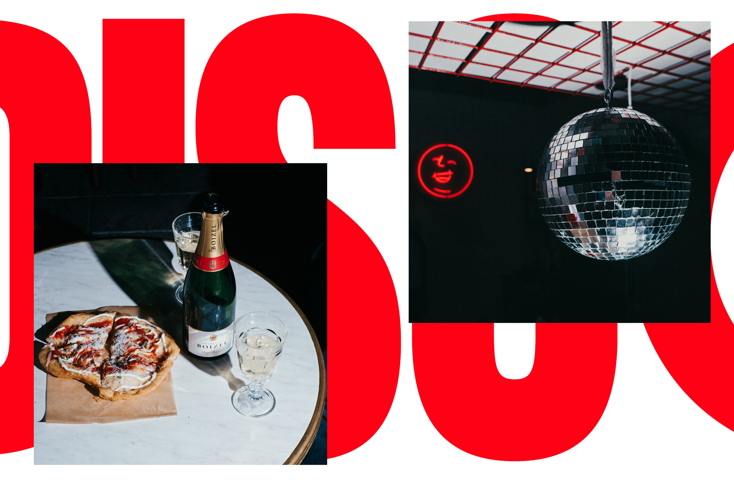
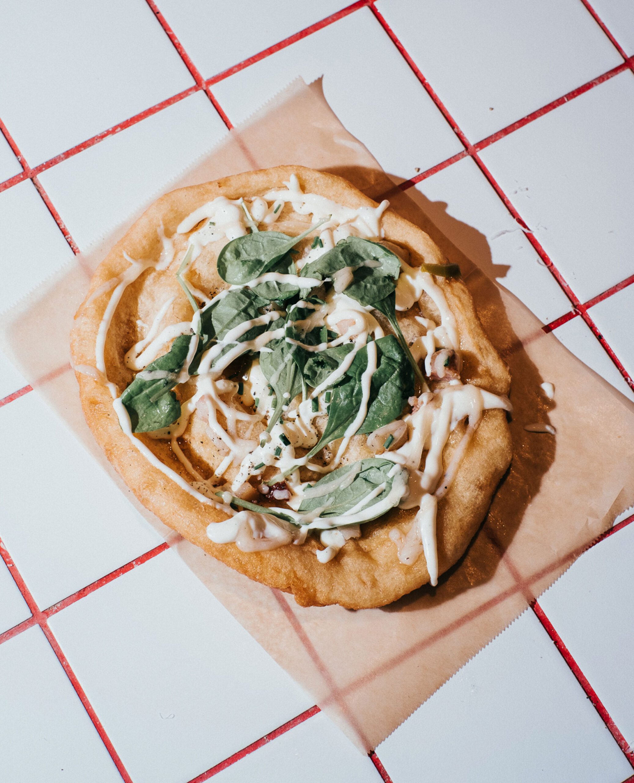
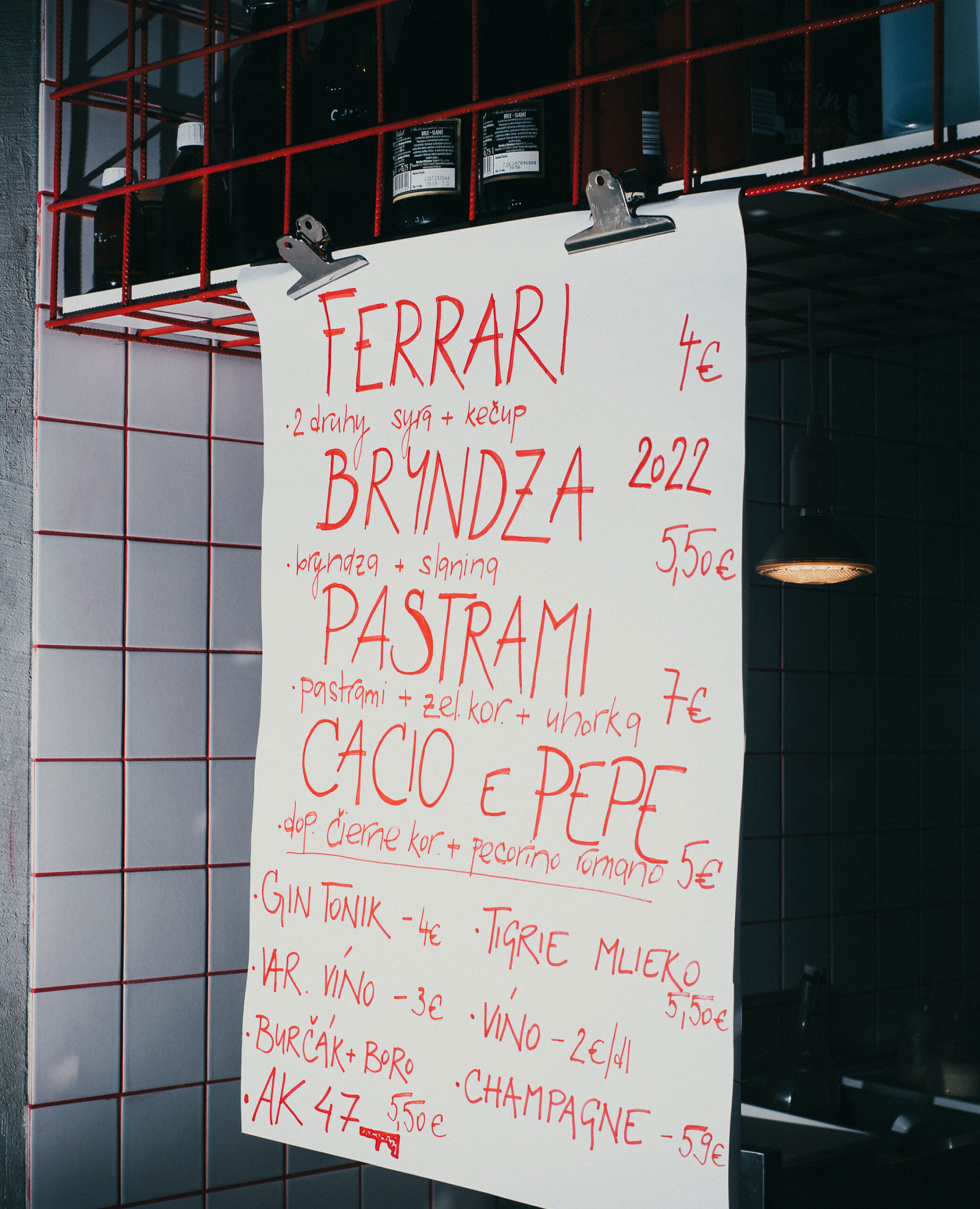
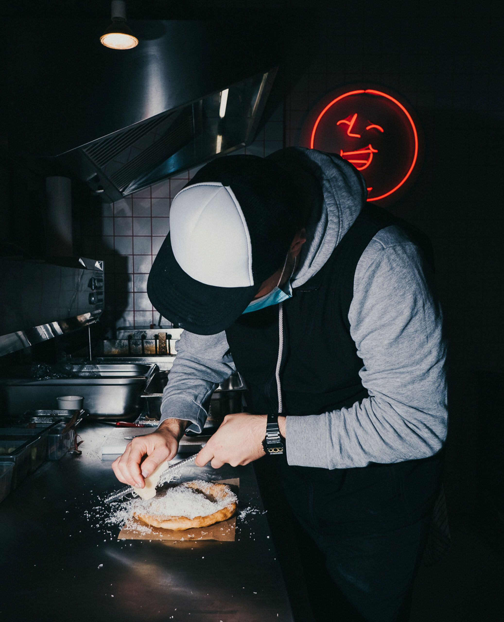
Langoš is one of the oldest and most loved street foods in Slovakia. LANGOS BAR upgrades the greasy deep-fried flatbread into a delicacy topped with pecorino, pastrami or shrimp and paired with delicious drinks and local natural wine.
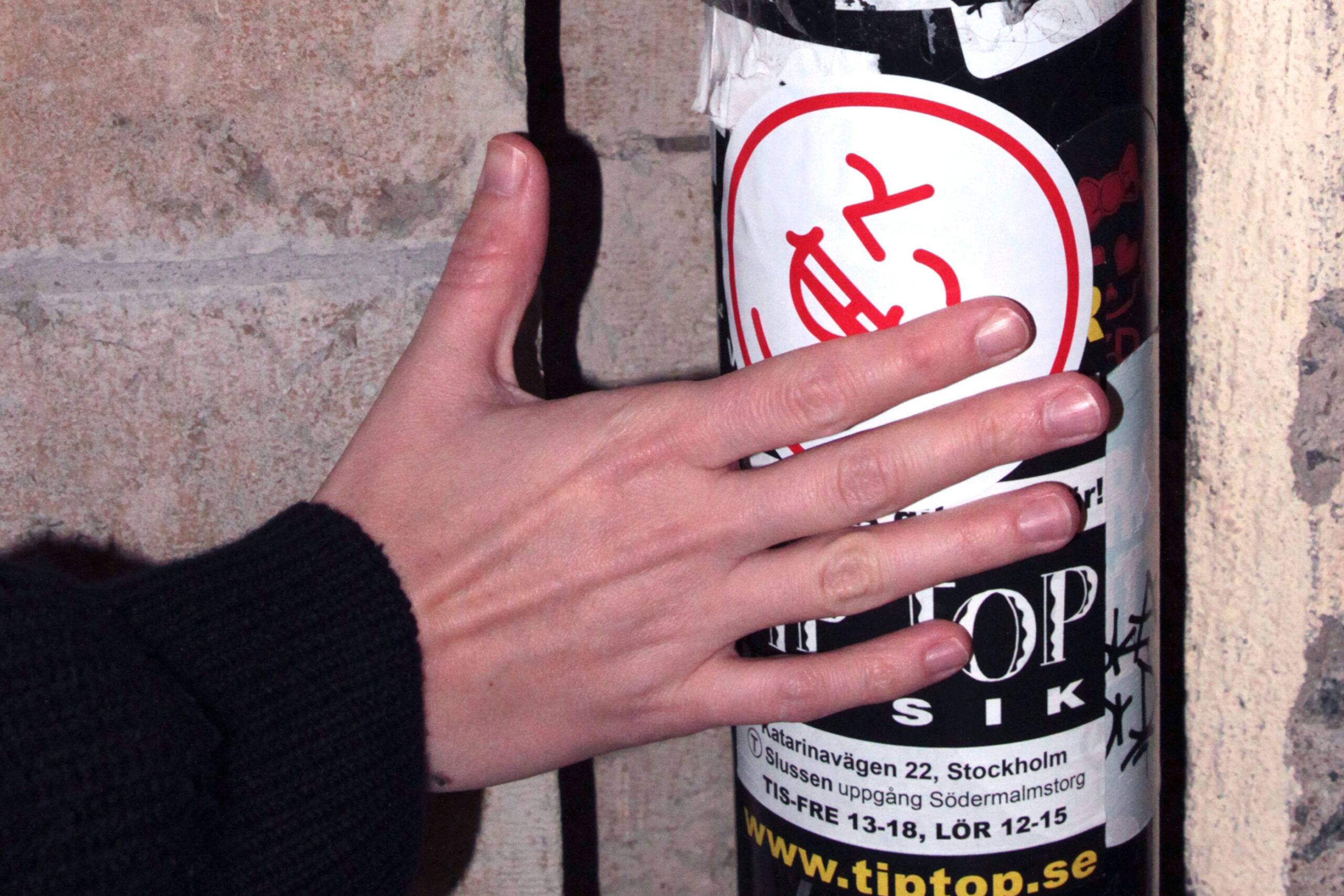
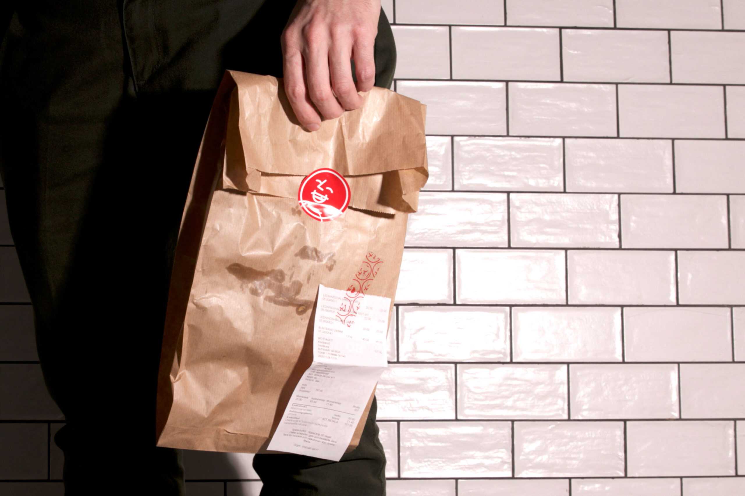
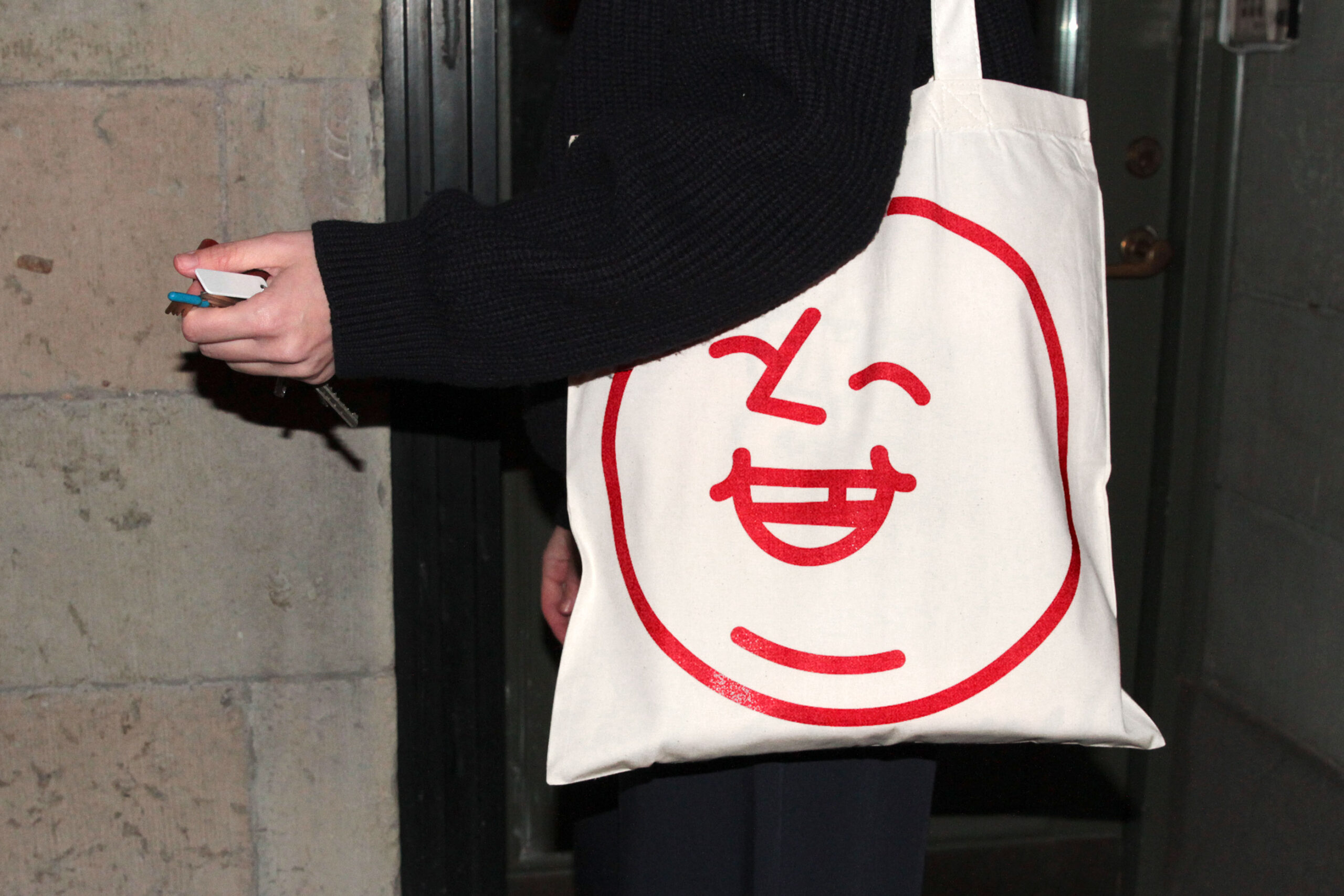
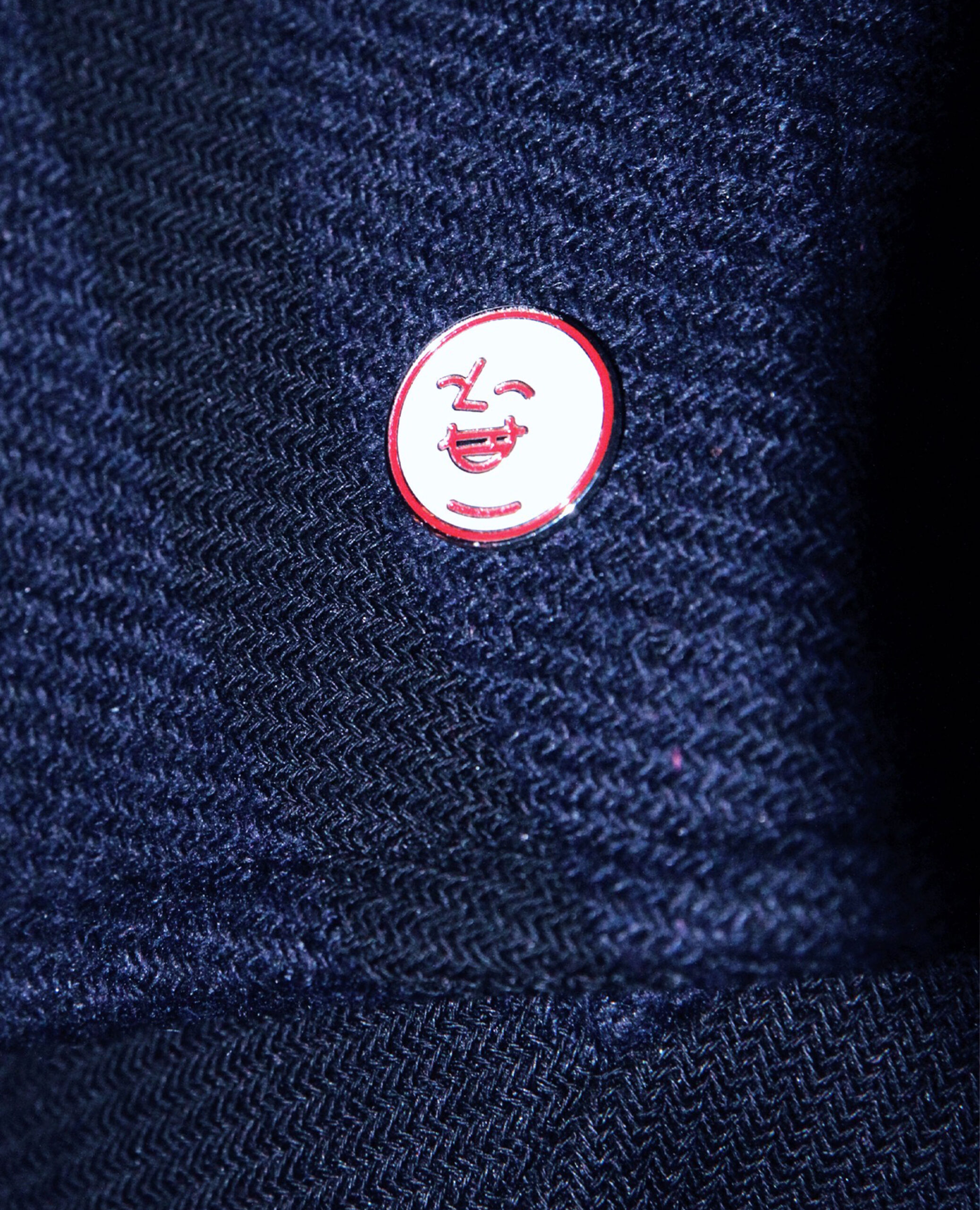
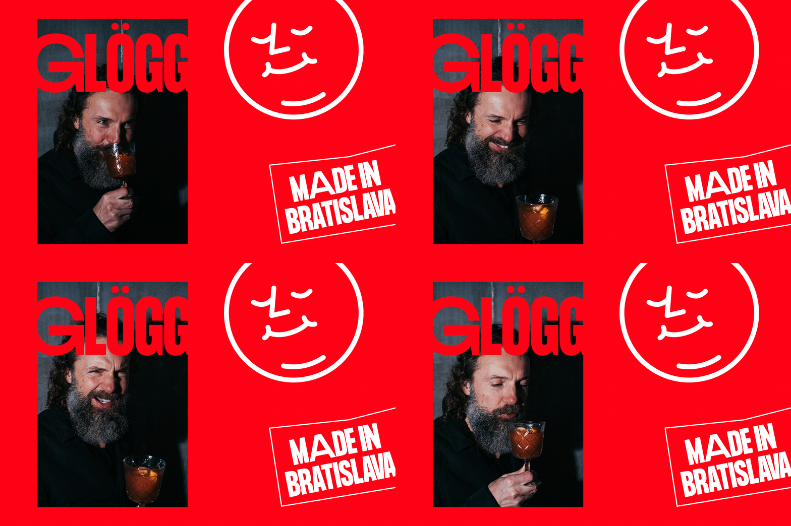
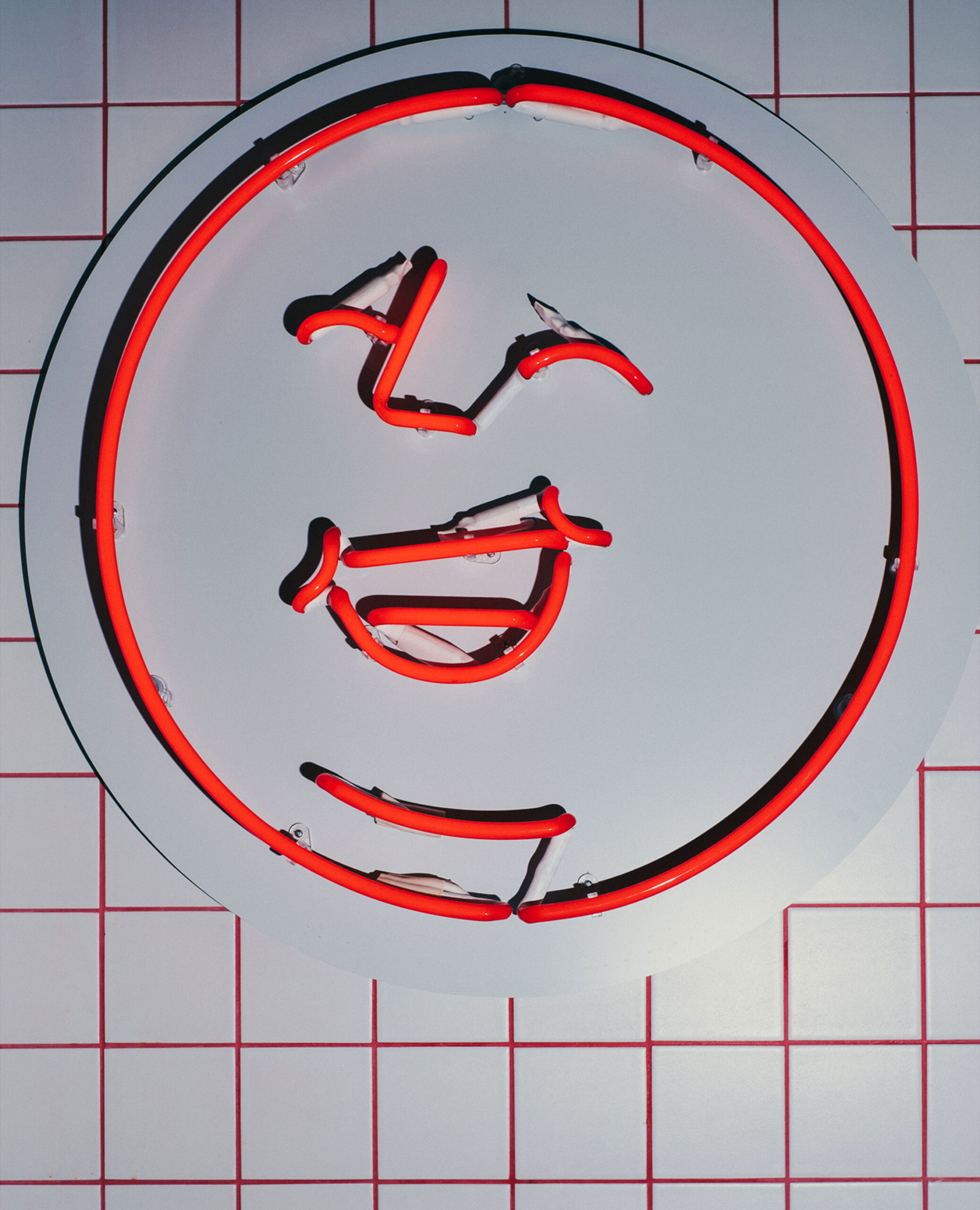
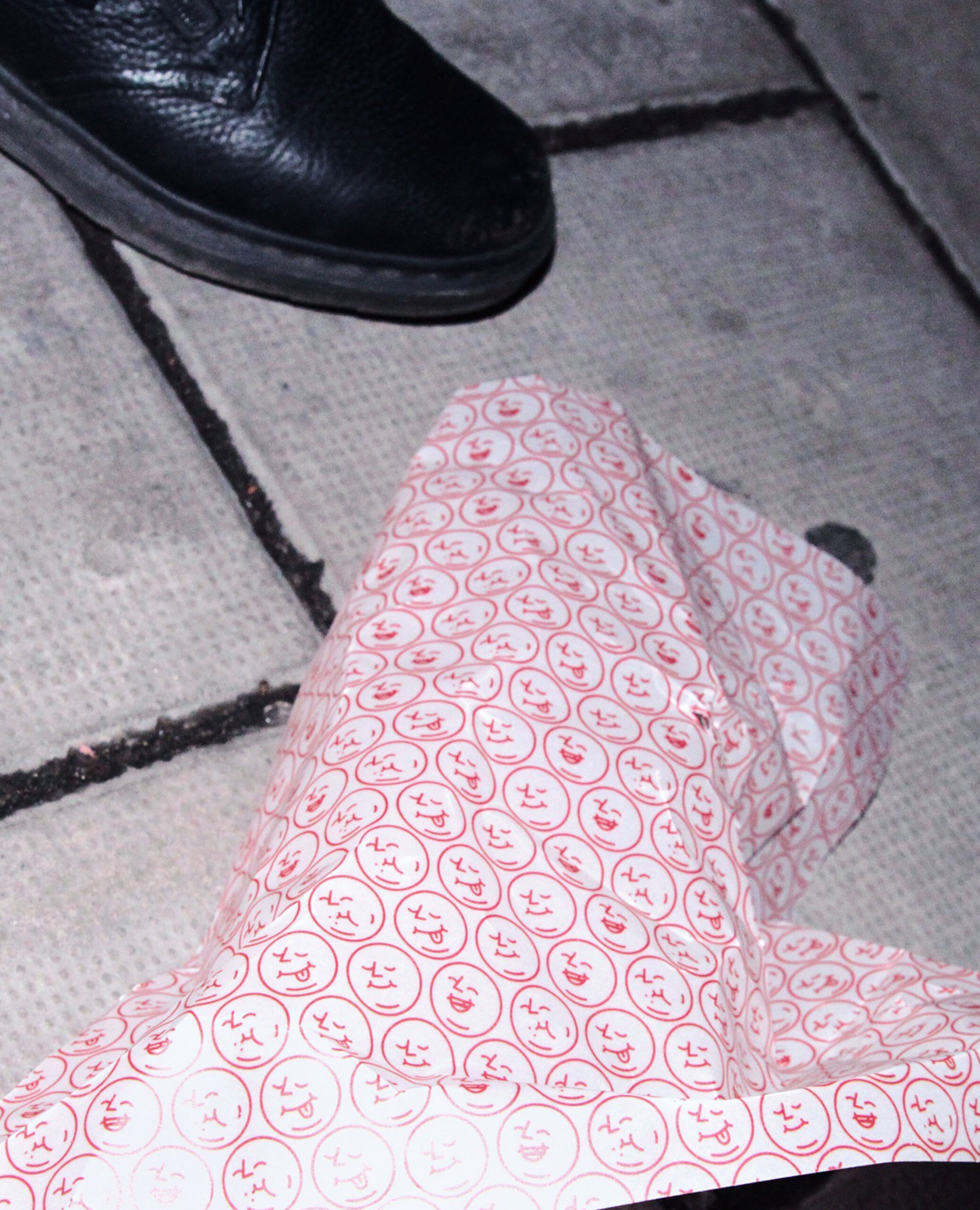
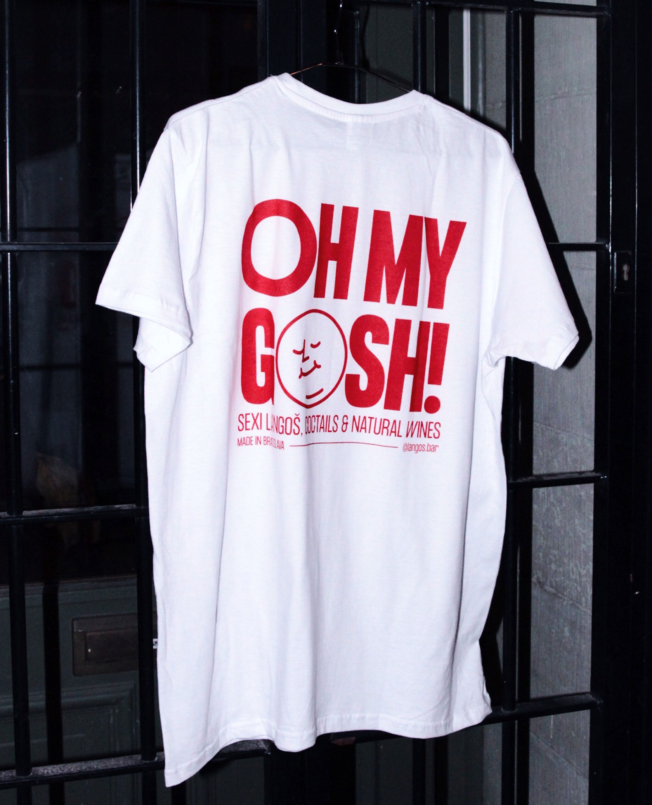
To bring the brand to life, we designed a bold identity that visualises the pleasure of eating a langoš. Together with the artist Tomáš Rybár, we created a character with a round, friendly and expressive face to work as LANGOS BAR’s logo. The modularity of the brand is reflected in our choice of a typeface with different glyph variations as well as in the different variations of the langoš face logo.
To balance it out, we kept the colour palette very simple and used just red, which you can also find in the details of LANOGOS BAR’S interior designed by GRAU architects.





ČIKEN BAR
The lockdown update
In January 2021 Langos bar was temporarily changed to Čiken bar – in the time of COVID lockdown, it was easier to deliver fried chicken than langoš to customer’s homes. The langoš face got a temporary make-over with a chicken mask and we also changed the colour from red to orange to emphasise the change of the food offer.
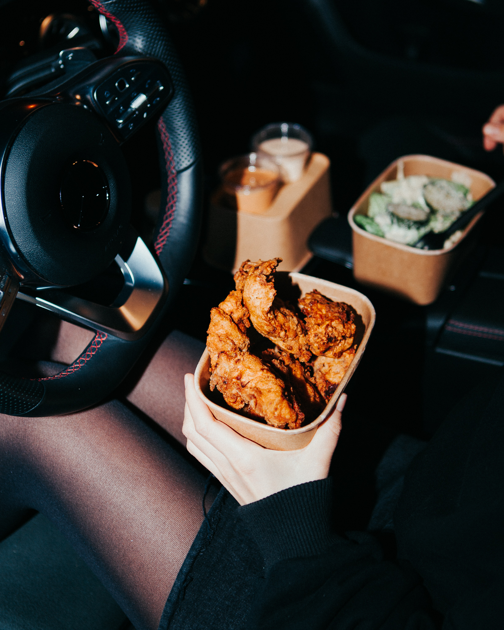



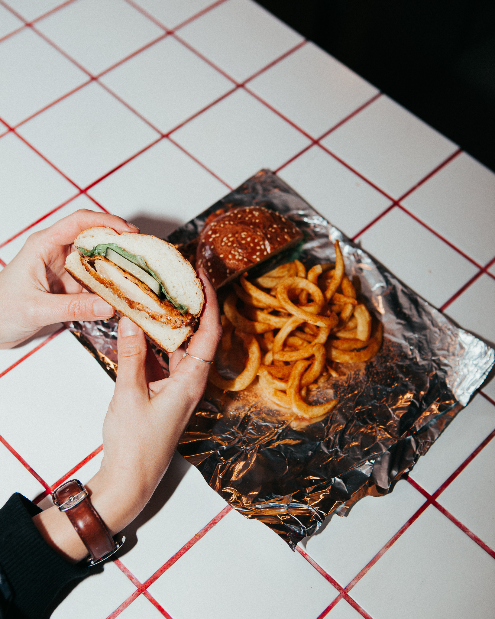
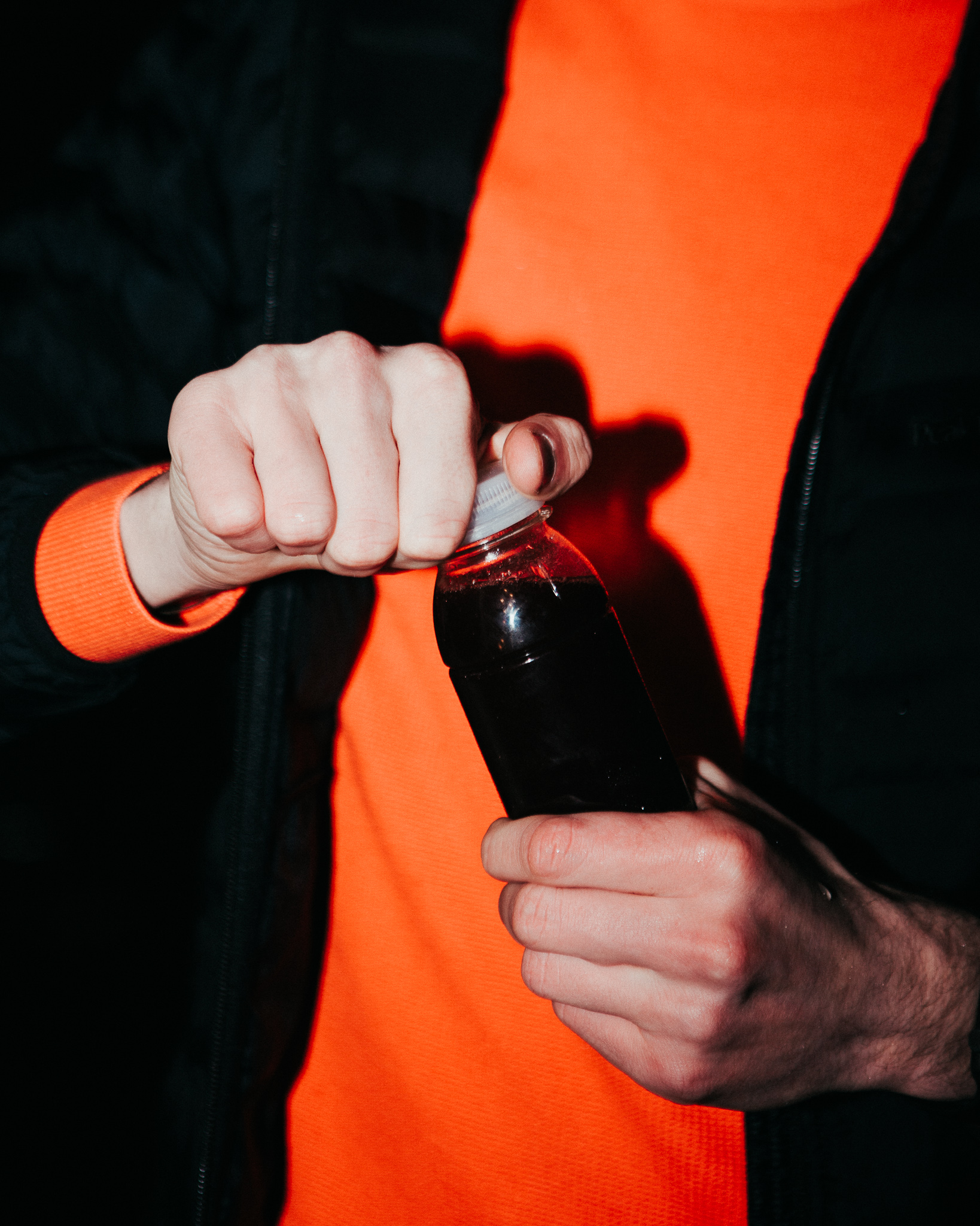

Photography: Miki ČurÍk
Interior architecture: Grau Architects
© 2020

AHOJ@NICEGUY.SK INSTAGRAM BĒHANCE
© 2024 NICE GUY
